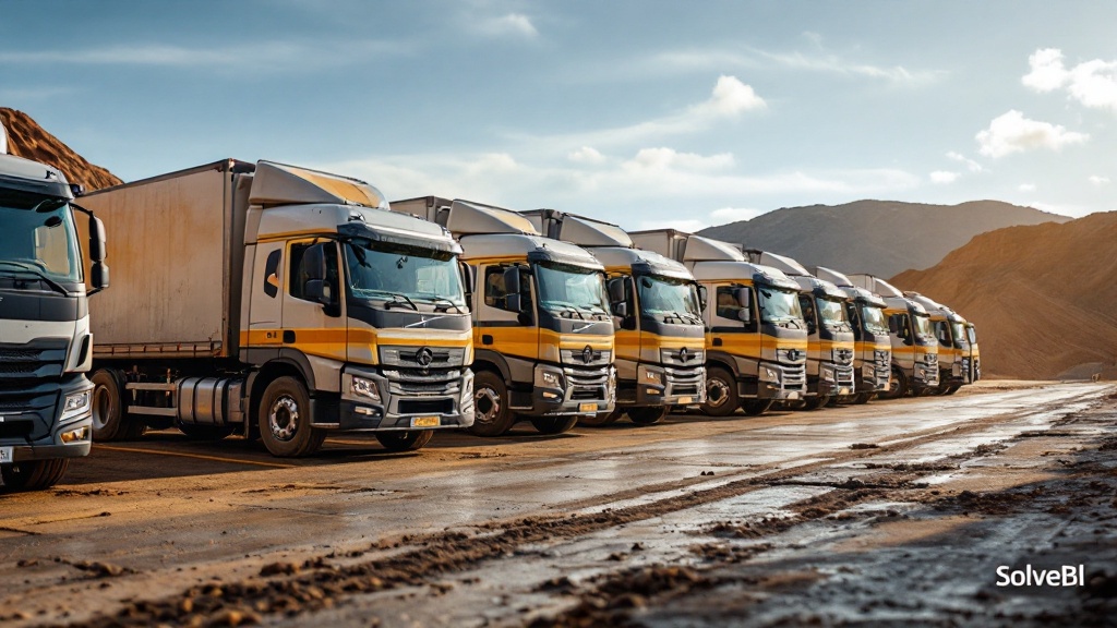
Why fleet utilisation is the most expensive metric most operators don't measure
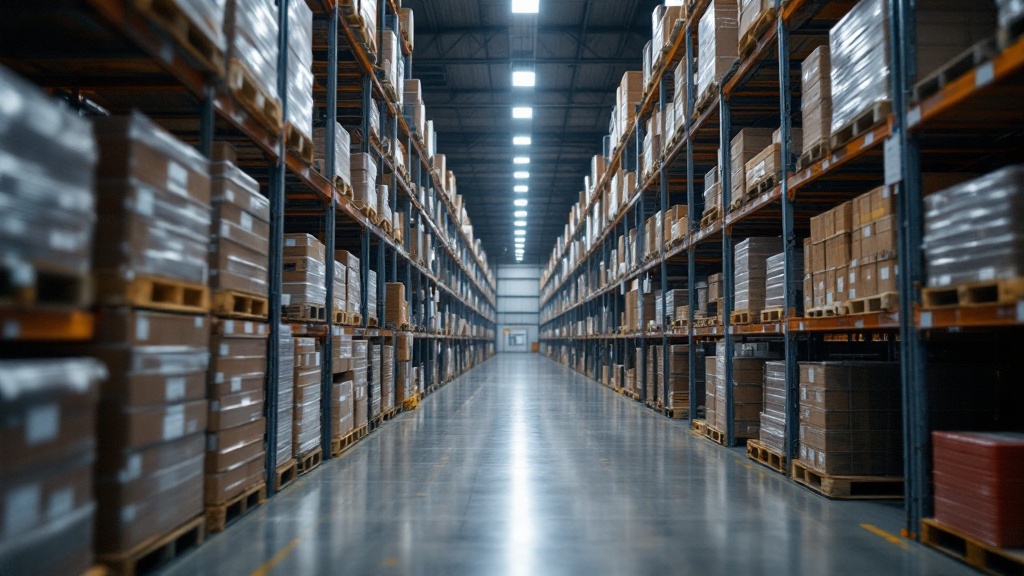
A vehicle that costs $180,000 to put on the road and another $120,000 a year to operate is an enormous fixed-cost commitment. When it is moving loaded, it generates revenue; when it is moving empty, it generates cost without revenue; when it is parked, it generates depreciation without either. The difference between a high-utilisation fleet and a low-utilisation one is not the trucks - it is whether anyone knows what each one is actually doing, hour by hour, day by day.
Good fleet utilisation reporting fixes that by bringing telematics, dispatch and revenue data into one view, exposing the assets and routes where capacity is being wasted, and giving operations the visibility to do something about it before the next capital decision lands.
The fleet utilisation metrics that belong on a dashboard
- Utilisation percentage - share of available hours each vehicle is actively working
- Loaded vs empty kilometres - the revenue-producing share of total distance travelled
- Idle time - both unproductive engine-on hours and parked-but-rostered hours
- Availability - hours the asset was operational vs in maintenance or off-road
- Revenue per asset-hour - the productivity benchmark that ties utilisation to dollars
- Capacity fill - average payload as a share of vehicle capacity, by route and shift
Identifying underused vehicles and routes
Fleet utilisation reporting is most valuable when it surfaces the specific assets and routes where capacity is consistently wasted. A handful of underused vehicles or a specific lane with persistent empty back-loads will usually account for a disproportionate share of the fleet's lost productivity. A useful dashboard makes this visible week-on-week so the team can take action - whether that is reassignment, route redesign or fleet right-sizing.
Linking utilisation to maintenance and fuel efficiency
Utilisation does not exist in isolation. A high-utilisation truck consumes more fuel and reaches maintenance intervals faster than a low-utilisation one. The dashboards we build link utilisation, fuel and maintenance into one model so the operations team can see the trade-offs - and so a decision to push utilisation higher comes with a clear view of the downstream cost and risk.
Telematics and GPS as the data foundation

Telematics and GPS systems generate enormous volumes of operational data - engine on/off, speed, location, fuel rate, payload, harsh-braking events. On their own, they tell the operations team what each truck is doing minute-by-minute. Joined to dispatch and revenue data in Microsoft Fabric, the same signals tell the business whether each truck is doing the right thing commercially. The integration is rarely difficult; the value is in the join.
Reducing cost through better asset allocation
Static vs dynamic asset allocation
| Aspect | Static allocation | Dynamic, reporting-driven allocation |
|---|---|---|
| How vehicles are assigned | Fixed rosters, rarely changed | Adjusted weekly based on actual utilisation and demand patterns |
| Underused vehicles | Invisible until annual review | Surfaced weekly as exceptions |
| Empty back-loads | Accepted as cost of doing business | Targeted for back-haul partnerships and lane redesign |
| Capital decisions | Based on gut feel and peak-day stories | Based on average-week data, with peak-day overlay |
What fleet utilisation looks like across sectors
Freight transport (line-haul and regional)
Empty back-loads and asymmetric lanes dominate. Reporting that surfaces lane-by-lane balance and the back-haul revenue opportunity is where the highest-value wins typically sit.
Postal and parcel delivery
High-volume, short-stop urban runs make capacity fill and stops-per-hour critical. Reporting that breaks utilisation down by depot and shift is what makes operational right-sizing possible.
Last-mile and gig logistics
Mixed-asset fleets (vans, e-bikes, contracted drivers) complicate utilisation calculations. Unified reporting that normalises across asset types is the foundation of any honest network view.
How Power BI and Microsoft Fabric tie telematics into a single utilisation view
On a typical SolveBI deployment we land telematics, GPS, fleet-management, maintenance and fuel-card data into Microsoft Fabric, then expose a single fleet-utilisation semantic model through Power BI. Dispatch sees the live availability view, fleet managers see the utilisation-by-asset view, finance sees the return-on-asset view, and executives see the consolidated network picture - all from one Power BI dataset rather than separate telematics and ERP reports.
Common mistakes in fleet utilisation reporting
- Utilisation without commercial context. A busy truck losing money is worse than an idle one - the dashboard should show both views.
- Average utilisation only. A 60% average can hide both 90% standout assets and 20% problem ones; distribution matters.
- No empty-kilometre view. Total kilometres tells the team nothing about productive use.
- Telematics in isolation. Without dispatch and revenue joined in, telematics shows what is happening but not whether it should be.
- Reporting weekly when daily would change behaviour. The data is available continuously - the reporting cadence should match the decisions it supports.
From scattered telematics to a live fleet productivity view.
Book a free 30-minute consultation with a Microsoft-certified SolveBI consultant. We'll map your telematics, dispatch and revenue data, agree the right utilisation metrics, and quote a phased Power BI deployment you can budget against.